Getting started with City Dive #3: Fleets, Trips and Maps
Find out how to use our advanced filters to navigate each page to its full potential. Focus the data to see the specifics, as well as the bigger picture.
Missed Getting started with City Dive #2? Read it here
In this article we'll go through the city page sections:
- Overview
- Fleets & trips
- Maps
- Newsfeed
Not yet a Backpacker?
Overview
As a Backpacker, you have access to 7 different cities:
- Bern 🇨🇭
- Bratislava 🇸🇰
- Gelsenkirchen 🇩🇪
- Linz 🇦🇹
- Toulouse 🇫🇷
- Valencia 🇪🇸
- Verona 🇮🇹
You can view individual city pages by clicking on them on the map, or you can use the sidebar to access the full city list.
There are four main components on the home screen:
- Key shared mobility figures
- Active operators
- Trip evolution
- Latest news
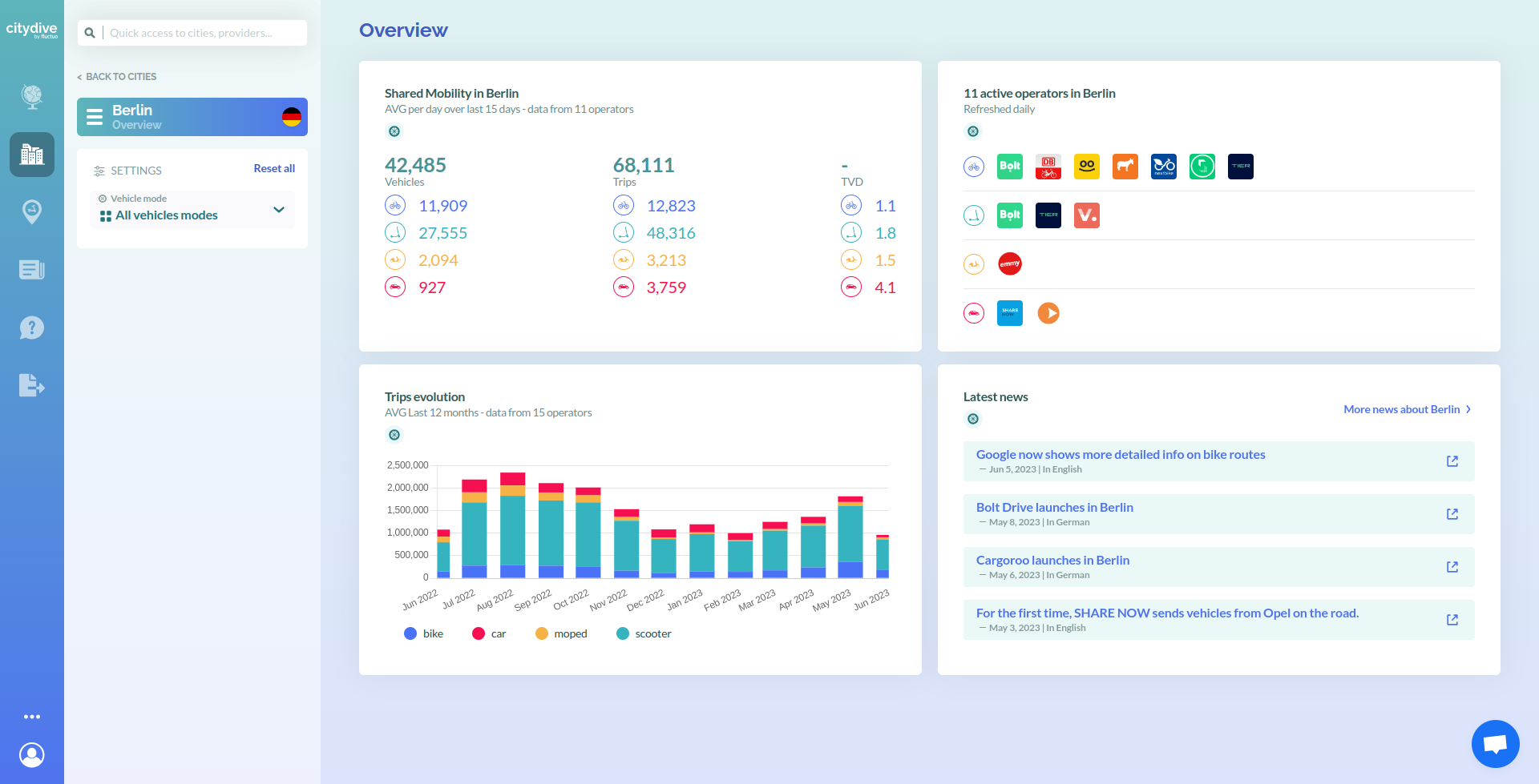
Key figures
This block gives you a quick overview of the last 7 days in terms of vehicles, trips, and trips per vehicle per day. It also provides a breakdown for each mode.
Active services
To the right, you will see a list of active operators available in the city, sorted by mode.
Trip evolution
The third section shows the average monthly trip evolution over the past year to date, whilst showing proportionally how the modes contribute to the overall number.
Latest news
The final block displays the latest news related to the city. Click on any news to go directly to the article, or for Great Explorers, you can click on ‘more news about City’ to explore all news.
Psst! If you want shared mobility news updates direct to your inbox, subscribe to our weekly newsletter.
If you want to zero in on a specific mode (e.g. scooters), click just under the flag of the country where it says ‘ALL MODES’ and select scooters.
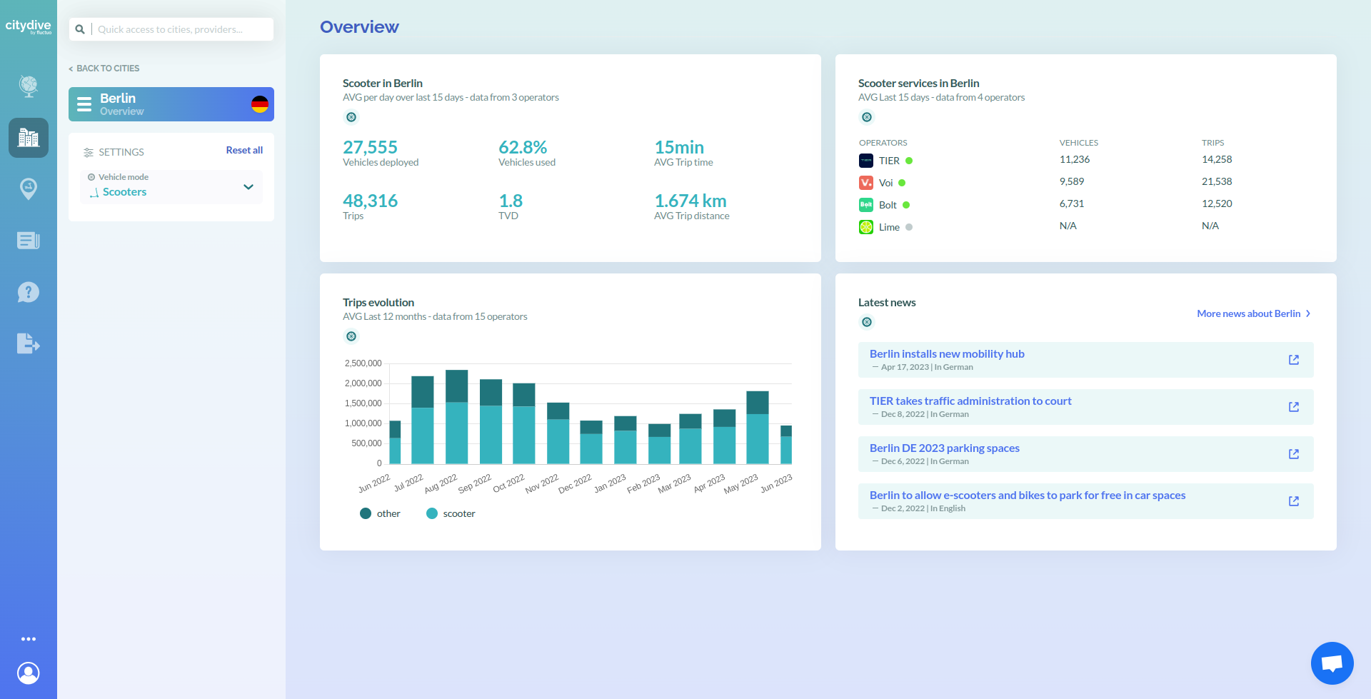
You will then see a city overview that is focused on scooters, with more granularity over the data shown on the previous screen. The scooter services in the top right will be updated, and the trip evolution graph will show scooter performance vs all other modes.
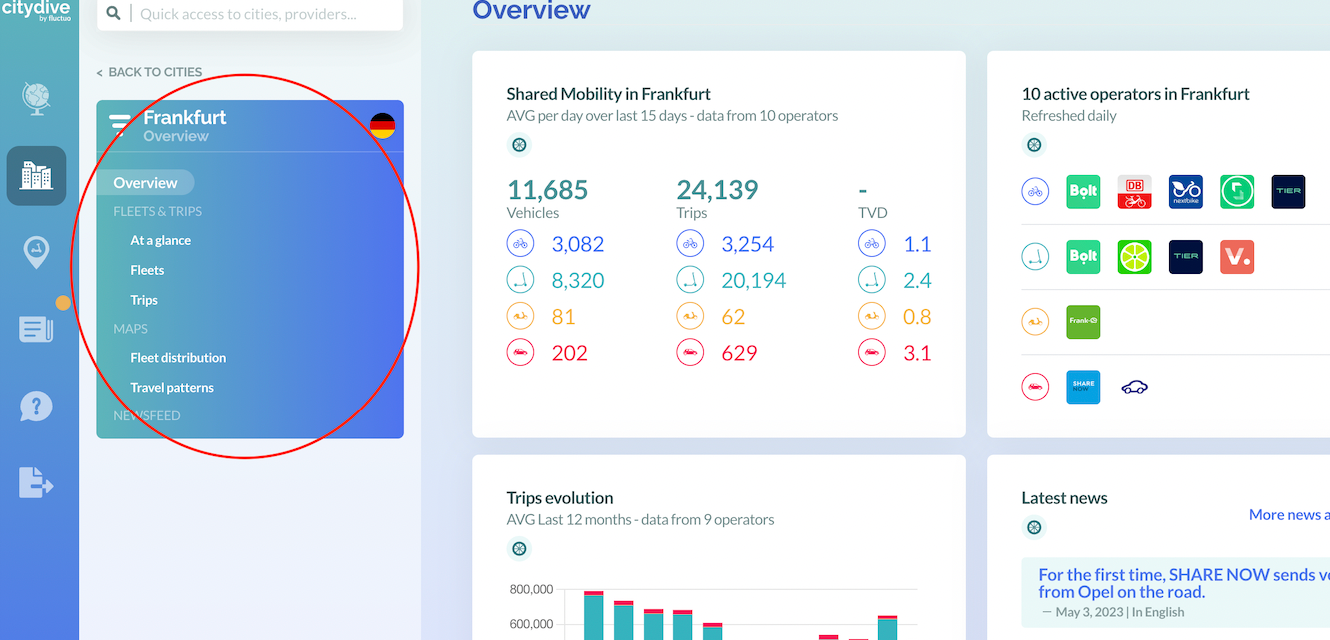
The navigation menu of the left hand side will allow you to organise data on the city into more specific detail. Hover your cursor over the city title to see the options menu.
The sections available are:
- Fleets and Trips
- Maps
- Newsfeed
Fleets and Trips
To deep dive into data on vehicles and usage, use the navigation menu on the left hand-side of the Overview page to explore ‘Fleets & trips’.
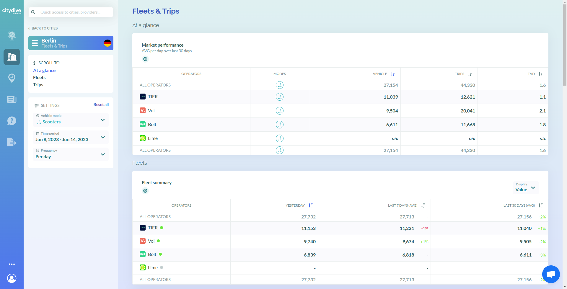
On the first table labelled ‘Market performance’ you will see a breakdown of the vehicles by mode and by operator, as well as the trips recorded over the last 30 days.
Scrolling down will show you some trends about the fleets and trips over time.
Let’s look at an example👇
Here we see a table that shows the number of trips per month, for the last six months of all modes. This table shows a comparison between the operators in the city.
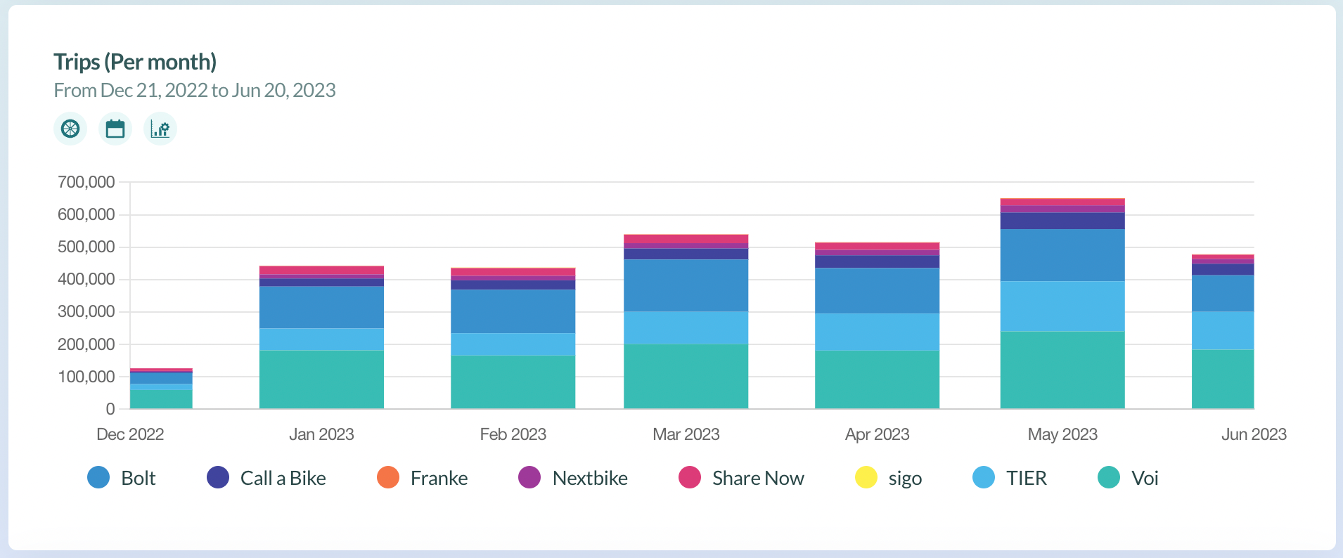
As before, you can focus on one specific mode by clicking ‘ALL MODES’ below the picture of the city and changing it to the desired mode.
Use the settings menu on the left of your screen to choose the time period for your analysis.
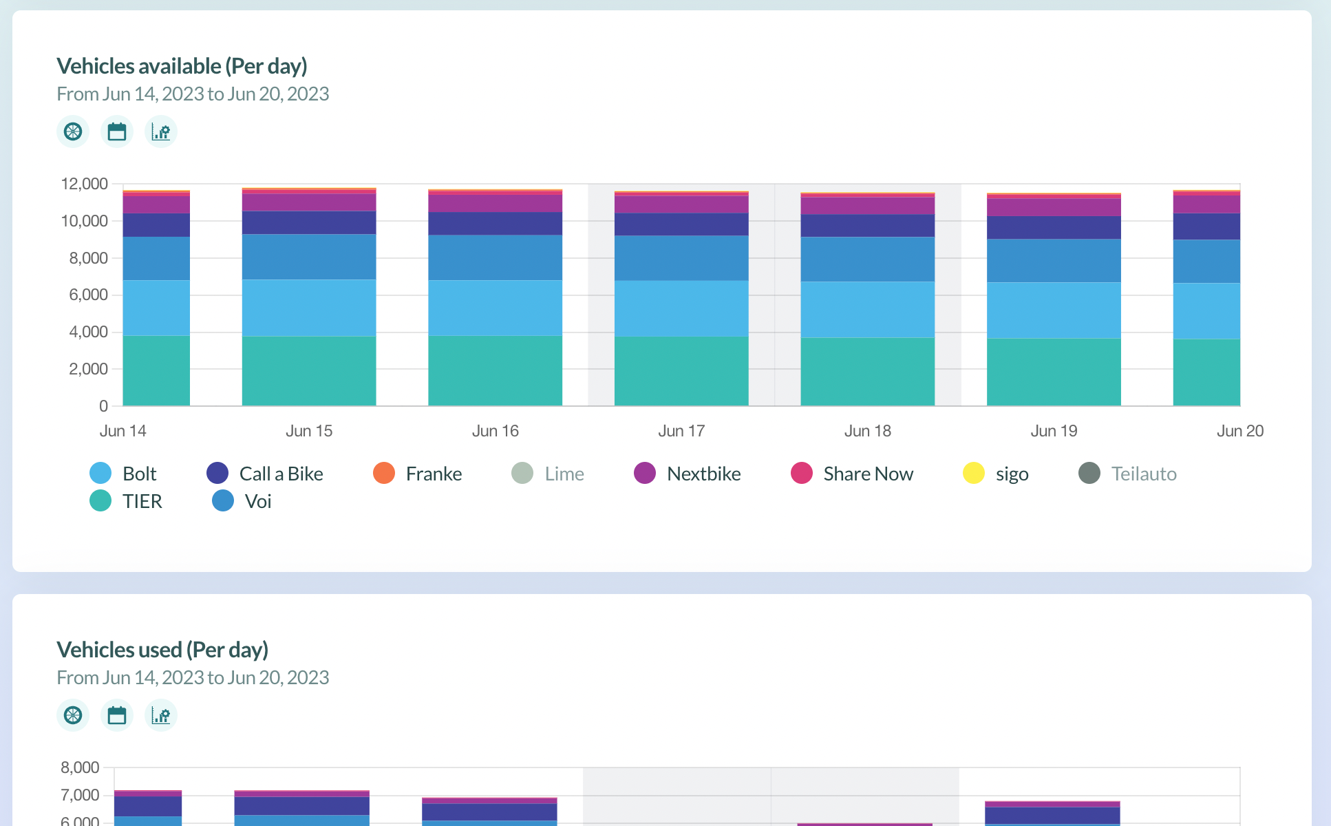
Scrolling down the page will show you the same analysis, but for trips rather than vehicles.
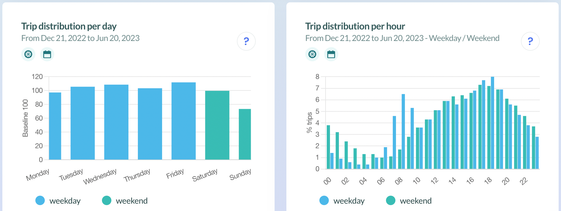
At the very bottom of the page, you will see a breakdown of usage throughout the week and during the day. This will help you identify peak hours in the day, and the key days of the week for travel for the modes you have selected.
Maps
City Dive is also able to show geospatial data too.
For an analysis of the city’s shared mobility hotspots, navigate to the ‘Maps’ tab.
There are two types of map, operating in similar ways:
- Fleet distribution - the distribution of vehicles within the city
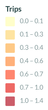
- Travel patterns - a map of where trips start and end
To switch between them, click the blue box labelled ‘Map’ and select your desired format.
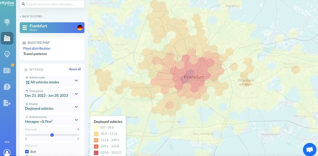
By selecting ‘settings’, you can refine your map even further.
With the settings menu, you can:
- Choose which modes you would like to display on the map.
- Select a specific time period.
- Decide on the statistical area and whether you want each hexagon to represent ~0.7km², or ~0.1km². Or, focus on the ‘administrative level’ (e.g. neighbourhoods, arrondissements or boroughs).
- Specify your preferred data scale.
- Specify your percentage data extract.
There is also a scale to help you interpret the graph in the bottom-left corner.
Now we've shown you the ropes, it’s time to set off. Head to City Dive and start exploring!
Bon voyage!
Fluctuo is the leader in mobility enablement. We provide key stakeholders with the most exhaustive, accurate data on the market to accelerate the growth of shared mobility.
Have a question? Talk to sales